The R & S must be in there from some points of view...

Moderators: kiore, Blip, The_Metatron
#1001 ![]() by newolder » Jun 10, 2010 6:17 pm
by newolder » Jun 10, 2010 6:17 pm

#1002 ![]() by Aern Rakesh » Jun 10, 2010 6:31 pm
by Aern Rakesh » Jun 10, 2010 6:31 pm
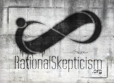
Emergence wrote:Nautilidae wrote:Were you inspired by the Mobius strip?Macdoc wrote:Infinity sign/endless discussion ?
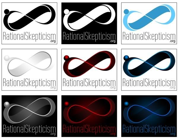
Yeah, it is a Möbius strip in the shape of the infinity sign. But i didn't think of "infinite discussions" (though it's probably a good thought, too) but rather "never ending inquiry" as one idea behind it. The second idea was the continuous surface of the Möbius strip signifying that Rationality and skepticism are different expressions of the same mindset (on one unbounded continuum), one always leading to the other, so to say. and the third was to, very, very abstractly integrate the rs into the image. The Ball gives it some dynamic, but also serves as part of the r. I thought it wasn't necessary to be obvious for the image to work and stand on its own, but might be a nice "gimmick" for those who recognize it....


")
#1003 ![]() by Macdoc » Jun 10, 2010 6:49 pm
by Macdoc » Jun 10, 2010 6:49 pm


")
#1004 ![]() by Oliver » Jun 10, 2010 7:08 pm
by Oliver » Jun 10, 2010 7:08 pm
Emergence wrote:
#1005 ![]() by Barry Cade » Jun 10, 2010 7:45 pm
by Barry Cade » Jun 10, 2010 7:45 pm

#1006 ![]() by THWOTH » Jun 10, 2010 7:51 pm
by THWOTH » Jun 10, 2010 7:51 pm

")
#1007 ![]() by Macdoc » Jun 10, 2010 8:34 pm
by Macdoc » Jun 10, 2010 8:34 pm


#1008 ![]() by Emergence » Jun 11, 2010 5:50 am
by Emergence » Jun 11, 2010 5:50 am

")
#1009 ![]() by Aern Rakesh » Jun 11, 2010 6:25 am
by Aern Rakesh » Jun 11, 2010 6:25 am
 Lovely.
#1010 ![]() by Emergence » Jun 11, 2010 6:31 am
by Emergence » Jun 11, 2010 6:31 am
#1011 ![]() by Aern Rakesh » Jun 11, 2010 6:33 am
by Aern Rakesh » Jun 11, 2010 6:33 am
#1012 ![]() by Emergence » Jun 11, 2010 6:42 am
by Emergence » Jun 11, 2010 6:42 am
#1013 ![]() by Aern Rakesh » Jun 11, 2010 8:27 am
by Aern Rakesh » Jun 11, 2010 8:27 am
Emergence wrote:Oh! It worked.
Errhm: You feel calm and relaxed. When i counted to three, you will wake up feeling refreshed and well .... 1 ... you feel the urge to lead a rational life .... 2 ... you will be skeptical of all extraordinary claims, no matter the source .... 3... You are awake and well. Hi Nora, thank you for visiting RationalSkepticism.org. You are now a RatSkep...
#1014 ![]() by Emergence » Jun 11, 2010 9:14 am
by Emergence » Jun 11, 2010 9:14 am
#1015 ![]() by zoon » Jun 11, 2010 9:19 am
by zoon » Jun 11, 2010 9:19 am
Emergence wrote:

#1016 ![]() by stijndeloose » Jun 11, 2010 9:21 am
by stijndeloose » Jun 11, 2010 9:21 am

Fallible wrote:Don't bacon picnic.
")
#1017 ![]() by Aern Rakesh » Jun 11, 2010 9:43 am
by Aern Rakesh » Jun 11, 2010 9:43 am
#1018 ![]() by Emergence » Jun 11, 2010 9:56 am
by Emergence » Jun 11, 2010 9:56 am
#1019 ![]() by Slacktoo » Jun 11, 2010 10:00 am
by Slacktoo » Jun 11, 2010 10:00 am
rEvolutionist wrote:rEvolutionist wrote:Emergence wrote:Nora_Leonard wrote:What if you did everything except the upper left RS in greyscale, and that RS in red?
If the rest of the image is inverted again, it looks kind of neat, but the problem remains: Even though one might have an association, it doesn't stand for or signify anything. It's just a posh nothing...
That's a great looking design, but I can't help thinking it looks too much like a skate shoe logo.
By the way Emergence, you must be a graphic designer by profession, yes? Some of the stuff you have come up with here, while I might not think all of it is a good choice for this site, is quite spectacularly good. I'm honestly amazed you can come up with so many professional labels in such quick succession. [/slobbering]
#1020 ![]() by Aern Rakesh » Jun 11, 2010 10:05 am
by Aern Rakesh » Jun 11, 2010 10:05 am
Emergence wrote:I was thinking "Résistance" when i did it. Then i thought "Vandalism".
I wouldn't think this particular style would make a good "main" logo, but probably again something for merchandising purposes. The spray-paint effect looks good (imo) on t-shirts and cups, too.
Users viewing this topic: No registered users and 1 guest