Posted: May 20, 2010 1:44 pm
Luis Dias wrote:Please, shh is on the right track there. I really like his fonts. I don't like the lightbulb too, but I think that's where you should be going.
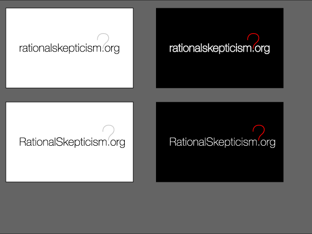
Hehe, it's helvetica, the ultimate in rational fonts, but you're right, the question mark and the words are different variants
I did try for the question mark doubling as a light-bulb, but it seemed a bit too busy, it didn't add, it just confused, but I'll keep at it, I like the idea, but not every good idea actually works.
Just to show what I mean about it not mattering too much about whether it's ratskep or rationalskepticism here's some variations:
I still think there should be more people throwing up some sketches here, I realise this is a competition, but the best way to get to something good is feedback.
I'd be careful with the gradients, I've used them in the past, and it's hard to get them consistent across different media, print and screen are two very different things when it comes to colour, even more so where the colour is graduated. That's not to say don't do it, just be careful. when we get something final, I'd like to see it on mugs, mousemats, etc. etc. and the simpler it is, the better they'll work.
And I'm still gonna put some rats up.