Posted: May 20, 2010 3:05 pm
Ok, to try get some idea what way we want to go font wise, here's some serif fonts against some sans serifs

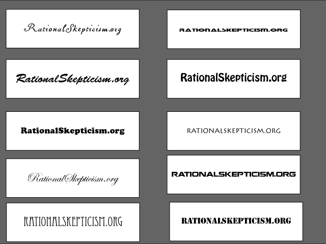
And some display fonts (which are tacky imo, but it might help get some direction)
And some display fonts (which are tacky imo, but it might help get some direction)
That's bascially what I'm working on, but it'll be separate from the type, to keep it legible.steve wrote:
Could the question mark be morphed into a rats tail as it hides behind or in the lettering?
It should be prominent enough, so long as it's there, it's worth considering though, maybe the o in org should get a capital too, or even the only capital?I'm With Stupid wrote:
And now I think of it, I think the .org bit is going to have to be a prominent bit of any logo, because people tend to default to .com .net or .their country.