Pull it together people. It's a piss take. That's a crazy idea for a logo.
Design us a logo! - Official RatSkep logo contest
Moderators: kiore, Blip, The_Metatron
Re: Design us a logo! - Official RatSkep logo contest
#941 ![]() by rEvolutionist » Jun 08, 2010 10:27 pm
by rEvolutionist » Jun 08, 2010 10:27 pm
Pull it together people. It's a piss take. That's a crazy idea for a logo.
God is a carrot.
Carrots exist.
Therefore God exists (and is a carrot).
Carrots exist.
Therefore God exists (and is a carrot).
-
rEvolutionist - Banned User
- Posts: 13678

- Country: dystopia
Re: Design us a logo! - Official RatSkep logo contest
#942 ![]() by rEvolutionist » Jun 08, 2010 10:30 pm
by rEvolutionist » Jun 08, 2010 10:30 pm
Ah, now I see where you got your Avatar MacDoc.
Emergence, I think this is a great logo as described above to Mac. What does everyone else think about the strength of the RS in the rat? Does it stand on it's own (with the aid of rationalskepticism.org below it), or are we biased by what we have seen so far?
God is a carrot.
Carrots exist.
Therefore God exists (and is a carrot).
Carrots exist.
Therefore God exists (and is a carrot).
-
rEvolutionist - Banned User
- Posts: 13678
- Country: dystopia
Re: Design us a logo! - Official RatSkep logo contest
#943 ![]() by rEvolutionist » Jun 08, 2010 10:30 pm
by rEvolutionist » Jun 08, 2010 10:30 pm

God is a carrot.
Carrots exist.
Therefore God exists (and is a carrot).
Carrots exist.
Therefore God exists (and is a carrot).
-
rEvolutionist - Banned User
- Posts: 13678
- Country: dystopia
Re: Design us a logo! - Official RatSkep logo contest
#944 ![]() by Barry Cade » Jun 08, 2010 10:50 pm
by Barry Cade » Jun 08, 2010 10:50 pm
Nora_Leonard wrote:
Then I don't get the joke.

But what I said still stands, someone without a mathematical or science background isn't going to get it.
What you don't get is what a pun is. It's meant to echo something else. Believe it or not, rs doesn't really have an answer. It's just meant to suggest maths. Which is kind of rational. Or something.
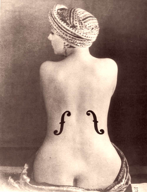
Regarding visual puns, in the picture below the woman isn't really a violin:
And this isn't really a bull:
.jpg)
And seriously, you would have to have lead an extraordinarily cloistered existence not to have come across a square number. I teach eight-year-olds about square numbers.
Whatever, I can see people want an amusing cartoon, or image of some sort, preferably with plenty of messages attached so as to cover all the bases.
Maybe this sort of thing would suit:
I'm bored with this, now. It's starting to resemble every other design-by-committee balls-up I've ever witnessed.
-

Barry Cade - Posts: 824
Re: Design us a logo! - Official RatSkep logo contest
#945 ![]() by rEvolutionist » Jun 08, 2010 10:52 pm
by rEvolutionist » Jun 08, 2010 10:52 pm
Barry Cade wrote:
Whatever, I can see people want an amusing cartoon, or image of some sort, preferably with plenty of messages attached so as to cover all the bases.
Maybe this sort of thing would suit:
I'm bored with this, now. It's starting to resemble every other design-by-committee balls-up I've ever witnessed.
God is a carrot.
Carrots exist.
Therefore God exists (and is a carrot).
Carrots exist.
Therefore God exists (and is a carrot).
-
rEvolutionist - Banned User
- Posts: 13678
- Country: dystopia
Re: Design us a logo! - Official RatSkep logo contest
#946 ![]() by Macdoc » Jun 08, 2010 11:06 pm
by Macdoc » Jun 08, 2010 11:06 pm
Rev wrote
The rat covers the bases for avatar, T-shirt, mug and also correctly identifies the site and where to go.
Despite having the domain Ratskep I think that is too opaque.
For the Banner the curious rat then can be pondering any number of things....
An atom for the science forum
A newspaper for the Current Events..
FSM for the skydaddy forum.

nothing for the philosophy forum etc
To be honest Mac, I like the interpretation in your current avatar. The RS rat with rationalskepticism.org written below it. RS I think is strong enough in the rat to stand out on it's own (although I could be a bit biased in that I have already seen it used in the ratskep rat. Perhaps someone should ask their better half to see if the RS rat can stand on it's own?).
The rat covers the bases for avatar, T-shirt, mug and also correctly identifies the site and where to go.
Despite having the domain Ratskep I think that is too opaque.
For the Banner the curious rat then can be pondering any number of things....
An atom for the science forum
A newspaper for the Current Events..
FSM for the skydaddy forum.
nothing for the philosophy forum etc
Travel photos > https://500px.com/macdoc/galleries
EO Wilson in On Human Nature wrote:
We are not compelled to believe in biological uniformity in order to affirm human freedom and dignity.
EO Wilson in On Human Nature wrote:
We are not compelled to believe in biological uniformity in order to affirm human freedom and dignity.
-

Macdoc - Posts: 17714
- Age: 76
- Country: Canada/Australia
")
Re: Design us a logo! - Official RatSkep logo contest
#947 ![]() by Emergence » Jun 09, 2010 6:33 am
by Emergence » Jun 09, 2010 6:33 am
Macdoc, here's another avatar version for you:

-

Emergence - Name: Peter B.
- Posts: 113
- Age: 48
")
Re: Design us a logo! - Official RatSkep logo contest
#948 ![]() by Macdoc » Jun 09, 2010 6:55 am
by Macdoc » Jun 09, 2010 6:55 am
Too busy I think and no real point to it.
Maybe a matching blue line underneath the RationalSkepticism that ends at the .org might tie the colours
Maybe a matching blue line underneath the RationalSkepticism that ends at the .org might tie the colours
Travel photos > https://500px.com/macdoc/galleries
EO Wilson in On Human Nature wrote:
We are not compelled to believe in biological uniformity in order to affirm human freedom and dignity.
EO Wilson in On Human Nature wrote:
We are not compelled to believe in biological uniformity in order to affirm human freedom and dignity.
-
Macdoc - Posts: 17714
- Age: 76
- Country: Canada/Australia
Re: Design us a logo! - Official RatSkep logo contest
#949 ![]() by Emergence » Jun 09, 2010 7:01 am
by Emergence » Jun 09, 2010 7:01 am
I'm not going to make custom avatars on demand. I just thought you might want a version that combines the RatSkep, with RationalSkepticism.
Also, i really think we could have Barry's more serious "rs" and the rat. Let's keep the rat for merchandising (along with other designs like e.g the chimp) and combine it with the serious logo whenever possible (Avatars, which are not exactly merchandising, are about the only applications where i see no way to combine both):
Also, i really think we could have Barry's more serious "rs" and the rat. Let's keep the rat for merchandising (along with other designs like e.g the chimp) and combine it with the serious logo whenever possible (Avatars, which are not exactly merchandising, are about the only applications where i see no way to combine both):
-
Emergence - Name: Peter B.
- Posts: 113
- Age: 48
Re: Design us a logo! - Official RatSkep logo contest
#950 ![]() by Aern Rakesh » Jun 09, 2010 9:01 am
by Aern Rakesh » Jun 09, 2010 9:01 am
rEvolutionist wrote:
Ah, now I see where you got your Avatar MacDoc.
Emergence, I think this is a great logo as described above to Mac. What does everyone else think about the strength of the RS in the rat? Does it stand on it's own (with the aid of rationalskepticism.org below it), or are we biased by what we have seen so far?
What do you mean, does it stand on its own? I think the domain below helps the viewer to 'see' the RS in the rat. But maybe that's what you mean?
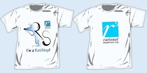
The blue rat remains one of my favourites. However I see what Emergence means, re: Barry's R to the power of s (even if I've expressed doubts about it latterly!) The T-shirt with both on it is very nice.
Whatever we choose as a logo, I'm not sure it's a good idea for it to serve as any individual forum member's avatar?

-

Aern Rakesh - RS Donator
- Posts: 13582
- Age: 75

- Country: UK (London)
")
Re: Design us a logo! - Official RatSkep logo contest
#951 ![]() by SPMaximus » Jun 09, 2010 9:14 am
by SPMaximus » Jun 09, 2010 9:14 am
Nora_Leonard wrote:Whatever we choose as a logo, I'm not sure it's a good idea for it to serve as any individual forum member's avatar?
+1
Im not sure what use it is to have a logo linking to rationalskepticism.org on rationalskepticism.org
-

SPMaximus - RS Donator
- Posts: 3779
- Age: 33
")
Re: Design us a logo! - Official RatSkep logo contest
#952 ![]() by Emergence » Jun 09, 2010 9:46 am
by Emergence » Jun 09, 2010 9:46 am
I thought this was more a test to see if it works as avatar, no?
-
Emergence - Name: Peter B.
- Posts: 113
- Age: 48
Re: Design us a logo! - Official RatSkep logo contest
#953 ![]() by Aern Rakesh » Jun 09, 2010 10:09 am
by Aern Rakesh » Jun 09, 2010 10:09 am
Emergence wrote:I thought this was more a test to see if it works as avatar, no?
Well Macdoc seems to be using it as his avatar! If he's doing it as a test, fair enough.
I was thinking the small size would be used for something else, not entirely sure what. Of course it could be made into those 'banned' or "troll" avatars, which is one use for it, and from that point of view, it's nice to see it in that size.
-
Aern Rakesh - RS Donator
- Posts: 13582
- Age: 75
- Country: UK (London)
Re: Design us a logo! - Official RatSkep logo contest
#954 ![]() by Emergence » Jun 09, 2010 11:59 am
by Emergence » Jun 09, 2010 11:59 am
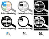
Two further Logos using "RS". They both do not provide much in terms of "deeper" symbolism and have no further connection to the community.
The first could be seen as either "shield against irrationality" or "spearhead of the rational movement" if one desperately wants to interpret it symbolic. Else, it's simply a rounded triangle to give the logo some shape. Might look a bit "superhero-ish" on t-shirts.
 (<- clickable thumbnail, full-view opens in new window)
The second one is pretty obviously a magnifying glass with the "correctly oriented" version of the stylized "rs" sticking out. The magnifying-glass can also be interpreted as "Q", the symbol for 'rational numbers' (put together a symbolic combination of rationality and skepticism). I realize that one may "Rorschach" some undesired symbolism into it again, but it's just supposed to illustrate a general idea.
 (<- clickable thumbnail, full-view opens in new window)
I know they are both not very good and likely not clear enough, but maybe they can serve for further inspiration to others.
The first could be seen as either "shield against irrationality" or "spearhead of the rational movement" if one desperately wants to interpret it symbolic. Else, it's simply a rounded triangle to give the logo some shape. Might look a bit "superhero-ish" on t-shirts.
The second one is pretty obviously a magnifying glass with the "correctly oriented" version of the stylized "rs" sticking out. The magnifying-glass can also be interpreted as "Q", the symbol for 'rational numbers' (put together a symbolic combination of rationality and skepticism). I realize that one may "Rorschach" some undesired symbolism into it again, but it's just supposed to illustrate a general idea.
I know they are both not very good and likely not clear enough, but maybe they can serve for further inspiration to others.
-
Emergence - Name: Peter B.
- Posts: 113
- Age: 48
Re: Design us a logo! - Official RatSkep logo contest
#955 ![]() by Aern Rakesh » Jun 09, 2010 12:06 pm
by Aern Rakesh » Jun 09, 2010 12:06 pm
I really like the shiny shield one, i.e. the one on the right. I don't think that it matters if there isn't any symbolism, considering that we can't agree on the symbolism of most things in the first place. 
The shield one is definitely 'logo-like', and might make a good starting point for an inspired banner...
The shield one is definitely 'logo-like', and might make a good starting point for an inspired banner...
-
Aern Rakesh - RS Donator
- Posts: 13582
- Age: 75
- Country: UK (London)
Re: Design us a logo! - Official RatSkep logo contest
#956 ![]() by LIFE » Jun 09, 2010 12:11 pm
by LIFE » Jun 09, 2010 12:11 pm
Nora_Leonard wrote:I really like the shiny shield one, i.e. the one on the right. I don't think that it matters if there isn't any symbolism, considering that we can't agree on the symbolism of most things in the first place.
The shield one is definitely 'logo-like', and might make a good starting point for an inspired banner...
+1
-

LIFE - Site Admin
- THREAD STARTER
- Posts: 7158
- Age: 43
- Country: Germany
Re: Design us a logo! - Official RatSkep logo contest
#957 ![]() by Macdoc » Jun 09, 2010 1:19 pm
by Macdoc » Jun 09, 2010 1:19 pm
Emergence » Jun 09, 2010 8:01 am
I'm not going to make custom avatars on demand. I just thought you might want a version that combines the RatSkep, with RationalSkepticism.
I appreciate that - it's not for the avatar it's towards getting a well balanced logo for the forum is all...
I put it into the avatar so it gets some exposure and continuity....I thought the blue line might integrate text with image.
It was purely a suggested tweak.
The RS quasi triangle is "okay" for looks but
a) looks like a cop badge or hood ornament
b) says little about the nature of the forum
c) has no "fun" embedded"
I think the pondering rat does a better job of covering those bases and is engaging..looks good on a T as well
••
Nora
Whatever we choose as a logo, I'm not sure it's a good idea for it to serve as any individual forum member's avatar?
see above...the idea is to sort of show the change in what I like and provide exposure outside the thread body.
I'll return to Bill on a Silverwing soon enough.

Close to the truth for me - 300 km mostly in the dark to test fire my cool weather gear arriving home at 3 am.
Part of it too is seeing how it scales down. Can it still be read? I think the rationalskepticism.org is important all the time if it's not going to be just eye candy but rather a "call to the curious" to come and visit.
It is both the url AND the mission statement. ....and with the curious rat above it - softens and makes it fun/intriguing
RatSkep is a step removed and it's convenient to have the url but it does not spell out the mission of rational skepticism for those not familiar with the forum.
I'd like to see Life indicate what the Logo should contain or whether he just would like eye candy.
Should it have the full URL?
Should it indicate the nature ( fun/serious ) of the forum?
Should it show aspects like "curiousity" as the Rat one does.?
The banner of course has lots of space....the smaller space of the squarish logo format limits potential content.
Emergence thanks for the good work
Travel photos > https://500px.com/macdoc/galleries
EO Wilson in On Human Nature wrote:
We are not compelled to believe in biological uniformity in order to affirm human freedom and dignity.
EO Wilson in On Human Nature wrote:
We are not compelled to believe in biological uniformity in order to affirm human freedom and dignity.
-
Macdoc - Posts: 17714
- Age: 76
- Country: Canada/Australia
Re: Design us a logo! - Official RatSkep logo contest
#958 ![]() by SPMaximus » Jun 09, 2010 1:29 pm
by SPMaximus » Jun 09, 2010 1:29 pm
Im not a big fan of the "hood ornaments"
And theres a bit too much going on in the magnifying glass ones
And theres a bit too much going on in the magnifying glass ones
-
SPMaximus - RS Donator
- Posts: 3779
- Age: 33
Re: Design us a logo! - Official RatSkep logo contest
#959 ![]() by shh » Jun 09, 2010 1:40 pm
by shh » Jun 09, 2010 1:40 pm
Macdoc wrote:c) has no "fun" embedded"
There's really no point in demanding a fun logo, if someone designs something that's fun, great, setting it out as a necessity is going to mean getting a lot of crappy logos. It's the same as any other kind of organized fun, not fun.
These are design choices, particularly in a competition they should be left for the most part to the designer. That way we get a wide selection, by limiting these choices we limit the selection.I'd like to see Life indicate what the Logo should contain or whether he just would like eye candy.
Should it have the full URL?
Should it indicate the nature ( fun/serious ) of the forum?
Should it show aspects like "curiousity" as the Rat one does.?
I'm not sure that using the entries as avatars is beneficial either tbh, if one you've used gets picked it'll be Macdoc's old avatar rather than a new logo.
wiki wrote: despite the fact that chocolate is not a fruit[citation needed]
-

shh - Posts: 1523
")
Re: Design us a logo! - Official RatSkep logo contest
#960 ![]() by shh » Jun 09, 2010 1:42 pm
by shh » Jun 09, 2010 1:42 pm
Emergence wrote:Two further Logos using "RS". They both do not provide much in terms of "deeper" symbolism and have no further connection to the community.
I like the magnifying glass, particularly the top middle and right. The r needs something to make it more definitely an r, but I'm not sure what.
wiki wrote: despite the fact that chocolate is not a fruit[citation needed]
-
shh - Posts: 1523
Who is online
Users viewing this topic: No registered users and 1 guest